Picture books for adults: What B2B marketers can learn from children’s books
Picture books for adults: What B2B marketers can learn from children’s books
Picture books for adults: What B2B marketers can learn from children’s books
CONTENT CREATION
/
Bryan Reid

Source:
Bryan Reid
5-minute read. Stop over-explaining complex solutions. Use picture-book principles: plain words, visuals that show structure, and consistent cues across every asset. This article will show why plain language and consistent visuals keep the story stable across a buying group.
Article at a glance
Buying decisions involve many stakeholders and most learning happens without the vendor present, so your story has to stay consistent across the group.
Use plain language so different roles don’t walk away with different interpretations of the same solution.
Use visuals that do the organizing so buyers can see how pieces connect without having to imagine it from text.
Keep visual cues consistent across assets so buyers don’t have to relearn the story every time they switch pages, formats, or revisit later.
According to Forrester, B2B purchase decisions now require alignment across an average of 13 stakeholders. That’s 13 people who need to agree on what a solution does, what it helps them achieve, and why it’s worth the effort. Yet buyers typically spend 83% of their time researching solutions on their own, and only 17% of their time meeting with potential suppliers.
As a result, marketing and sales need to make their robust (i.e. complex) technology solutions and their myriad of benefits:
easy to understand for each individual buyer
easy to agree upon, across the buying group
Unfortunately, what we often see are marketers relying too heavily on complex language and not taking advantage of the power of effective, consistent visuals to explain the value of their solutions and how they work.
This may sound strange, but we think there are lessons to be learned from the simplicity of children’s picture books and their effective use of both plain language AND relevant visuals. Their ability to tell a story from beginning to end, in an easy-to-understand way, is something we as B2B marketers should aspire to.
Plain language minimizes risk
B2B marketing teams often try to say too much to cover every capability and avoid leaving anything out. This results in long, complex sentences that can’t be easily understood. Here’s an anonymized example from a cloud product brief:
“XYZ is a platform and broad set of distributed cloud and edge computing services, including virtual machines, graphical processing units, cloud storage and databases, network optimization and security services, and lightweight serverless functions to help businesses build, deploy, and manage applications and workloads on the world’s most distributed network.”
Sentences like this are asking a lot of the reader in one pass. It’s not just long. It packs seven distinct items into one sentence. It’s easy to see how different members of a buying group who are consuming content like this could get confused and form widely different perspectives on the solution’s value.
Children’s picture book authors in contrast work under different constraints. Holding a child’s attention is not easy, and many books are 500 words or less, which forces every line to earn its place. The language has to be immediately understood, or the story breaks. What parent wants to read a story that leaves their child confused and constantly asking questions? That same discipline matters in B2B marketing because buying groups need to agree on many key points before they can make a decision.
We’re not advocating for B2B content to be written for a three-year-old, but we do think it’s worth asking:
Will ALL buyers immediately understand what this means?
Is there a simpler way to say this, to avoid the risk of confusion or misunderstanding?
Clear, consistent visuals help carry the story
One of the reasons we think B2B content contains so much complex language is that marketers are:
asking their readers to do all the work
asking too little from their visual elements
It results in too much information, not enough showing.
Here is an anonymized example of what that can look like in a cybersecurity brief:
“XYZ’s visualization capabilities further enhance visibility with dynamic, interactive graphical representations of the security landscape. These maps illustrate asset relationships, potential attack paths, and threat spread...”
First, this could be more simply written as: “Visualizing XYZ as a map helps illustrate relationships between assets”. But if it’s only described in text, the reader has to picture it for themself: the graphical representation of the security landscape, asset relationships, attack paths, etc. The odds of all stakeholders imagining the same thing are zero.
Children’s picture books take a completely different approach. Because of the audience and the word constraints, the images HAVE to carry much of the story and show how the pieces fit together. The words guide attention to what matters without trying to explain everything. When words and visuals work together that way, the reader can SEE how elements relate and the story stays consistent as it moves forward. This is an old one, but this illustration from Richard Scarry’s “What Do People Do All Day?” does a better job of explaining the various systems in a typical home than probably 90% of home improvement books.
Richard Scarry shows how to make a complex system easy to follow.
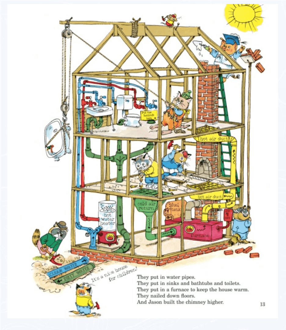
Source: Richard Scarry’s What Do People Do All Day?, written and illustrated by Richard Scarry (Random House Children’s Books, 1968), p. 13. Reduced-size excerpt reproduced here for review of how labels and colour make a complex system easy to follow.
What to notice: This illustration shows the different systems in a typical house, and it’s easy to follow each one because the labels and colors make the connections obvious.
Why it matters: The connections are visible, so the reader doesn’t have to piece it together from paragraphs.
That page highlights two things picture books do well, and they’re directly relevant to B2B content:
The imagery is designed for the audience’s ability, so recognition is immediate.
What matters is emphasized visually, so the reader doesn’t have to decide what to focus on.
In contrast, we often see detailed B2B diagrams that leave the buyer to figure out what matters and how things connect, which can easily lead to misinterpretation.
A third thing picture books do well is ensure that the imagery is consistent throughout the book. The same character, or scene is immediately recognizable from beginning to end.
Here’s a simple example of this consistency I mentioned in an earlier post.
Gossie & Gertie shows how consistent cues make recognition effortless.
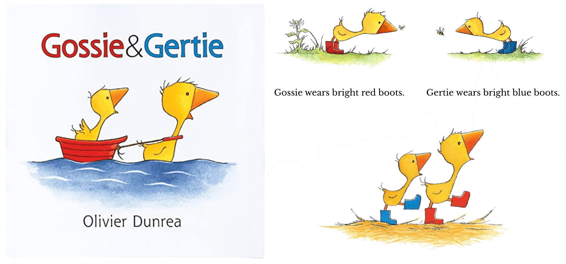
Source: Gossie & Gertie, written and illustrated by Olivier Dunrea (Clarion Books, 2002), cover and selected interior pages. Reduced-size excerpts reproduced here for review of how repeated visual cues support fast character recognition.
What to notice: Simple cues are called out and reused across pages. Gossie has red boots. Gertie has blue boots. When I mentioned this concept to a client recently, she knew exactly what I meant and recited it immediately: “Gossie has red boots. Gertie has blue boots.”
Why it matters: The reader doesn’t pause to interpret who they’re looking at. The cue does the work.
In B2B visuals, consistent labels, icons, and visual cues play the same role. They reduce re-learning and make it easier for a buying group to stay aligned on what they’re seeing.
When visuals help buyers connect information throughout an asset, words no longer need to carry the whole story on their own
Consistent visuals across assets reduce relearning
One final advantage picture books offer is continuity. When a reader picks up the next book in a series, the world feels familiar right away. They don’t have to relearn who is who or how to read the page before the story can move forward.
That’s the core takeaway for B2B. Buyers rarely consume content all at once. They return later and bring others into the conversation. When key concepts look the same every time they appear, it becomes easier to:
remember what they learned previously
incorporate what’s new
share the story with their buying peers
Here’s a simple example of what this looks like in practice.
Winnie-the-Pooh shows how series consistency prevents resets.
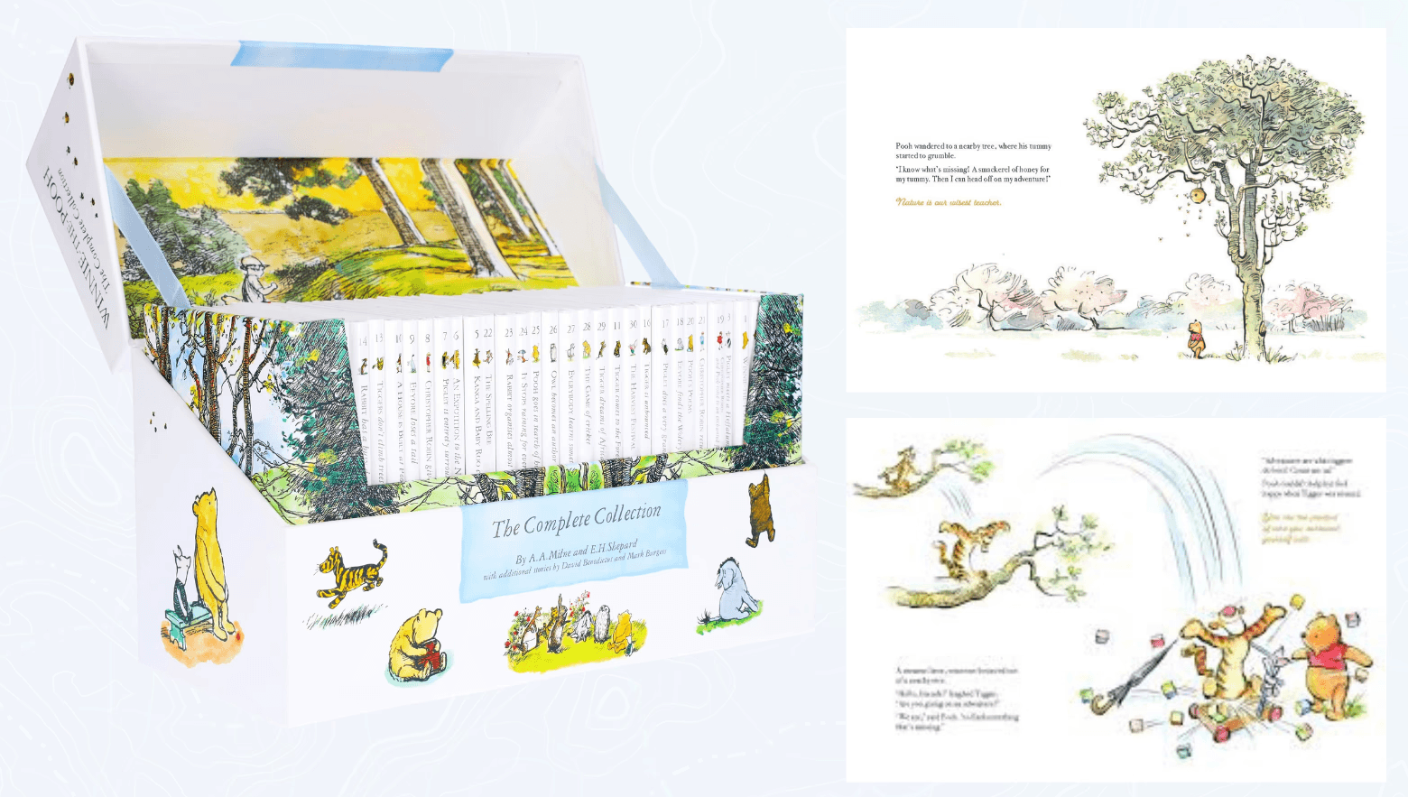
Source: Winnie-the-Pooh: The Complete Collection of Stories and Poems, by A. A. Milne, illustrated by E. H. Shepard (Egmont UK Ltd, 2001), slipcase and selected interior pages. Reduced-size excerpts reproduced here for review of how recurring characters and visual style create continuity across a series.
What to notice: The characters and visual style stay consistent across the series, so each book feels familiar the moment you open it.
Why it matters: The reader doesn’t have to reorient before they can start learning new information. They recognize what they’re looking at immediately.
In B2B content, we often see the opposite, usually because assets are created by different teams or agencies at different times. The visuals on the website don’t match the images in briefs and pitch decks, and the explainer video introduces a different set of cues again. Each asset might be clear on its own, but together they don’t help the buyer carry what they’ve already learned to this new asset they’re consuming. Relearning is slow. Recognition is fast.
This isn’t anyone’s fault. But it does mean we’re asking prospects to do more mental work than necessary and increasing the likelihood of misalignment across the buying group.
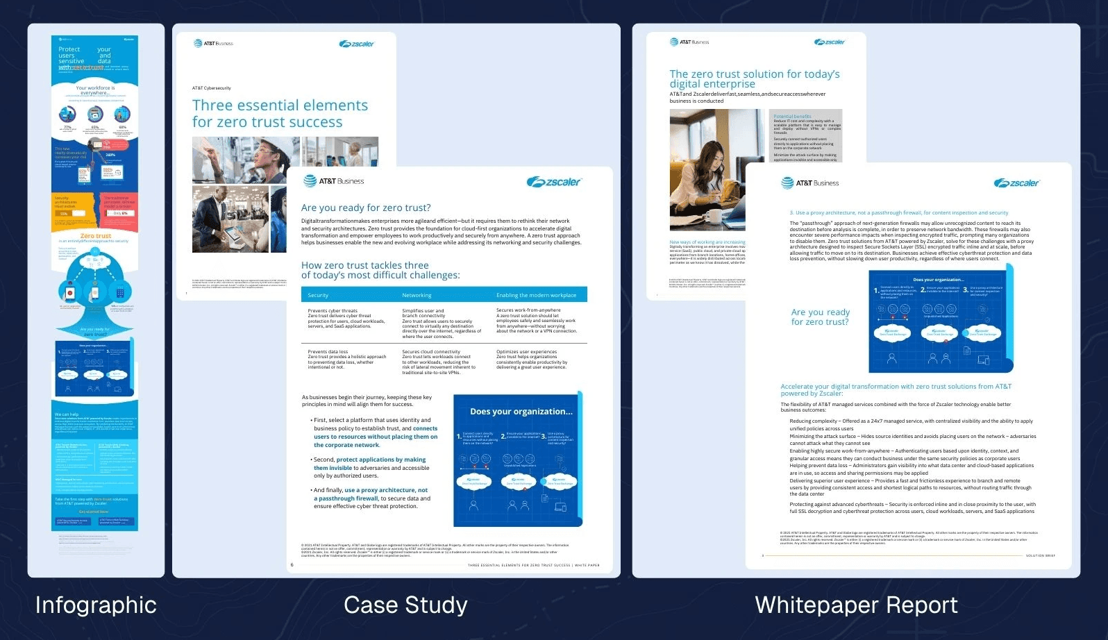
Credit: AT&T-Zscaler Infographic, Case Study, and Whitepaper Report, designed by Altitude.
In contrast, here’s an example of where we leveraged a ‘blueprint’ graphic about Zero Trust across an infographic, case study, and whitepaper, to help buyers build upon their learning as they move from asset to asset.
Three lessons to remember
When it comes to creating B2B content about complex solutions, picture books remind us of three approaches that can improve individual buyer understanding and increase alignment across multiple stakeholders:
use plain language that’s easy for all stakeholders to understand
incorporate clear visuals that can help carry the story
ensure your visuals are consistent across assets, to improve recognition and reduce the need for relearning
In the end, we want our buyers to experience the same feeling as children at the end of our stories. They understood it, and they liked what they learned. They want to learn more.
Frequently asked questions
1) How many people are involved in an enterprise B2B buying decision today?
On average, 13 people are involved in the buying decision, and 89% of purchases involve two or more departments (Forrester, 2024). That means your story has to hold across roles, not just resonate with one stakeholder.
2) What does it mean that B2B buyers spend only 17% of their time meeting suppliers?
Gartner reports buyers typically spend only 17% of their time meeting with potential suppliers (Gartner, 2020). The practical implication is that most evaluation happens outside supplier meetings, across content and internal conversations, so buyers form their understanding from assets they consume on their own.
3) Why do buying groups end up with different interpretations of the same B2B solution?
Because stakeholders learn independently and bring different context to what they read. When key relationships are only explained in text, people fill gaps differently and carry different versions of the story into internal discussions, which slows alignment.
4) How do you simplify B2B product messaging without “dumbing it down”?
Use plain language that reduces interpretation. The goal is not less substance. It’s fewer stacked sentences that pack too many distinct ideas into one pass. Plain language makes it easier for different roles to take away the same meaning before they ever see a visual.
5) What are the “picture book for adults” principles for B2B content?
Picture books work because they remove guesswork and keep meaning stable as the story moves. In B2B, that translates to three principles:
Plain language that lands quickly across roles
Visuals that do the organizing by showing how pieces connect
Consistent cues across assets (labels, icons, colors, structure) so the story doesn’t reset when buyers re-enter later
6) How do you keep visuals consistent across assets so buyers don’t have to relearn the story?
Start with one anchor visual for a high-impact solution, then reuse the same structure and labels across your website, briefs, decks, and videos. Consistent cues reduce re-learning, make re-entry easier, and help buying groups stay aligned on the same story.
About Author

Connect with Bryan Reid on LinkedIn and follow Altitude here.
5-minute read. Stop over-explaining complex solutions. Use picture-book principles: plain words, visuals that show structure, and consistent cues across every asset. This article will show why plain language and consistent visuals keep the story stable across a buying group.
Article at a glance
Buying decisions involve many stakeholders and most learning happens without the vendor present, so your story has to stay consistent across the group.
Use plain language so different roles don’t walk away with different interpretations of the same solution.
Use visuals that do the organizing so buyers can see how pieces connect without having to imagine it from text.
Keep visual cues consistent across assets so buyers don’t have to relearn the story every time they switch pages, formats, or revisit later.
According to Forrester, B2B purchase decisions now require alignment across an average of 13 stakeholders. That’s 13 people who need to agree on what a solution does, what it helps them achieve, and why it’s worth the effort. Yet buyers typically spend 83% of their time researching solutions on their own, and only 17% of their time meeting with potential suppliers.
As a result, marketing and sales need to make their robust (i.e. complex) technology solutions and their myriad of benefits:
easy to understand for each individual buyer
easy to agree upon, across the buying group
Unfortunately, what we often see are marketers relying too heavily on complex language and not taking advantage of the power of effective, consistent visuals to explain the value of their solutions and how they work.
This may sound strange, but we think there are lessons to be learned from the simplicity of children’s picture books and their effective use of both plain language AND relevant visuals. Their ability to tell a story from beginning to end, in an easy-to-understand way, is something we as B2B marketers should aspire to.
Plain language minimizes risk
B2B marketing teams often try to say too much to cover every capability and avoid leaving anything out. This results in long, complex sentences that can’t be easily understood. Here’s an anonymized example from a cloud product brief:
“XYZ is a platform and broad set of distributed cloud and edge computing services, including virtual machines, graphical processing units, cloud storage and databases, network optimization and security services, and lightweight serverless functions to help businesses build, deploy, and manage applications and workloads on the world’s most distributed network.”
Sentences like this are asking a lot of the reader in one pass. It’s not just long. It packs seven distinct items into one sentence. It’s easy to see how different members of a buying group who are consuming content like this could get confused and form widely different perspectives on the solution’s value.
Children’s picture book authors in contrast work under different constraints. Holding a child’s attention is not easy, and many books are 500 words or less, which forces every line to earn its place. The language has to be immediately understood, or the story breaks. What parent wants to read a story that leaves their child confused and constantly asking questions? That same discipline matters in B2B marketing because buying groups need to agree on many key points before they can make a decision.
We’re not advocating for B2B content to be written for a three-year-old, but we do think it’s worth asking:
Will ALL buyers immediately understand what this means?
Is there a simpler way to say this, to avoid the risk of confusion or misunderstanding?
Clear, consistent visuals help carry the story
One of the reasons we think B2B content contains so much complex language is that marketers are:
asking their readers to do all the work
asking too little from their visual elements
It results in too much information, not enough showing.
Here is an anonymized example of what that can look like in a cybersecurity brief:
“XYZ’s visualization capabilities further enhance visibility with dynamic, interactive graphical representations of the security landscape. These maps illustrate asset relationships, potential attack paths, and threat spread...”
First, this could be more simply written as: “Visualizing XYZ as a map helps illustrate relationships between assets”. But if it’s only described in text, the reader has to picture it for themself: the graphical representation of the security landscape, asset relationships, attack paths, etc. The odds of all stakeholders imagining the same thing are zero.
Children’s picture books take a completely different approach. Because of the audience and the word constraints, the images HAVE to carry much of the story and show how the pieces fit together. The words guide attention to what matters without trying to explain everything. When words and visuals work together that way, the reader can SEE how elements relate and the story stays consistent as it moves forward. This is an old one, but this illustration from Richard Scarry’s “What Do People Do All Day?” does a better job of explaining the various systems in a typical home than probably 90% of home improvement books.
Richard Scarry shows how to make a complex system easy to follow.
Source: Richard Scarry’s What Do People Do All Day?, written and illustrated by Richard Scarry (Random House Children’s Books, 1968), p. 13. Reduced-size excerpt reproduced here for review of how labels and colour make a complex system easy to follow.
What to notice: This illustration shows the different systems in a typical house, and it’s easy to follow each one because the labels and colors make the connections obvious.
Why it matters: The connections are visible, so the reader doesn’t have to piece it together from paragraphs.
That page highlights two things picture books do well, and they’re directly relevant to B2B content:
The imagery is designed for the audience’s ability, so recognition is immediate.
What matters is emphasized visually, so the reader doesn’t have to decide what to focus on.
In contrast, we often see detailed B2B diagrams that leave the buyer to figure out what matters and how things connect, which can easily lead to misinterpretation.
A third thing picture books do well is ensure that the imagery is consistent throughout the book. The same character, or scene is immediately recognizable from beginning to end.
Here’s a simple example of this consistency I mentioned in an earlier post.
Gossie & Gertie shows how consistent cues make recognition effortless.
Source: Gossie & Gertie, written and illustrated by Olivier Dunrea (Clarion Books, 2002), cover and selected interior pages. Reduced-size excerpts reproduced here for review of how repeated visual cues support fast character recognition.
What to notice: Simple cues are called out and reused across pages. Gossie has red boots. Gertie has blue boots. When I mentioned this concept to a client recently, she knew exactly what I meant and recited it immediately: “Gossie has red boots. Gertie has blue boots.”
Why it matters: The reader doesn’t pause to interpret who they’re looking at. The cue does the work.
In B2B visuals, consistent labels, icons, and visual cues play the same role. They reduce re-learning and make it easier for a buying group to stay aligned on what they’re seeing.
When visuals help buyers connect information throughout an asset, words no longer need to carry the whole story on their own
Consistent visuals across assets reduce relearning
One final advantage picture books offer is continuity. When a reader picks up the next book in a series, the world feels familiar right away. They don’t have to relearn who is who or how to read the page before the story can move forward.
That’s the core takeaway for B2B. Buyers rarely consume content all at once. They return later and bring others into the conversation. When key concepts look the same every time they appear, it becomes easier to:
remember what they learned previously
incorporate what’s new
share the story with their buying peers
Here’s a simple example of what this looks like in practice.
Winnie-the-Pooh shows how series consistency prevents resets.
Source: Winnie-the-Pooh: The Complete Collection of Stories and Poems, by A. A. Milne, illustrated by E. H. Shepard (Egmont UK Ltd, 2001), slipcase and selected interior pages. Reduced-size excerpts reproduced here for review of how recurring characters and visual style create continuity across a series.
What to notice: The characters and visual style stay consistent across the series, so each book feels familiar the moment you open it.
Why it matters: The reader doesn’t have to reorient before they can start learning new information. They recognize what they’re looking at immediately.
In B2B content, we often see the opposite, usually because assets are created by different teams or agencies at different times. The visuals on the website don’t match the images in briefs and pitch decks, and the explainer video introduces a different set of cues again. Each asset might be clear on its own, but together they don’t help the buyer carry what they’ve already learned to this new asset they’re consuming. Relearning is slow. Recognition is fast.
This isn’t anyone’s fault. But it does mean we’re asking prospects to do more mental work than necessary and increasing the likelihood of misalignment across the buying group.
Credit: AT&T-Zscaler Infographic, Case Study, and Whitepaper Report, designed by Altitude.
In contrast, here’s an example of where we leveraged a ‘blueprint’ graphic about Zero Trust across an infographic, case study, and whitepaper, to help buyers build upon their learning as they move from asset to asset.
Three lessons to remember
When it comes to creating B2B content about complex solutions, picture books remind us of three approaches that can improve individual buyer understanding and increase alignment across multiple stakeholders:
use plain language that’s easy for all stakeholders to understand
incorporate clear visuals that can help carry the story
ensure your visuals are consistent across assets, to improve recognition and reduce the need for relearning
In the end, we want our buyers to experience the same feeling as children at the end of our stories. They understood it, and they liked what they learned. They want to learn more.
Frequently asked questions
1) How many people are involved in an enterprise B2B buying decision today?
On average, 13 people are involved in the buying decision, and 89% of purchases involve two or more departments (Forrester, 2024). That means your story has to hold across roles, not just resonate with one stakeholder.
2) What does it mean that B2B buyers spend only 17% of their time meeting suppliers?
Gartner reports buyers typically spend only 17% of their time meeting with potential suppliers (Gartner, 2020). The practical implication is that most evaluation happens outside supplier meetings, across content and internal conversations, so buyers form their understanding from assets they consume on their own.
3) Why do buying groups end up with different interpretations of the same B2B solution?
Because stakeholders learn independently and bring different context to what they read. When key relationships are only explained in text, people fill gaps differently and carry different versions of the story into internal discussions, which slows alignment.
4) How do you simplify B2B product messaging without “dumbing it down”?
Use plain language that reduces interpretation. The goal is not less substance. It’s fewer stacked sentences that pack too many distinct ideas into one pass. Plain language makes it easier for different roles to take away the same meaning before they ever see a visual.
5) What are the “picture book for adults” principles for B2B content?
Picture books work because they remove guesswork and keep meaning stable as the story moves. In B2B, that translates to three principles:
Plain language that lands quickly across roles
Visuals that do the organizing by showing how pieces connect
Consistent cues across assets (labels, icons, colors, structure) so the story doesn’t reset when buyers re-enter later
6) How do you keep visuals consistent across assets so buyers don’t have to relearn the story?
Start with one anchor visual for a high-impact solution, then reuse the same structure and labels across your website, briefs, decks, and videos. Consistent cues reduce re-learning, make re-entry easier, and help buying groups stay aligned on the same story.
About Author
Connect with Bryan Reid on LinkedIn and follow Altitude here.


Ready to move your
B2B buyers forward?
Contact Altitude today to clarify your complex solutions—so your B2B audience quickly understands, trusts, and takes action.
Copyright © 2026 Altitude Management.
All rights reserved.
Ready to move your
B2B buyers forward?
Contact Altitude today to clarify your complex solutions—so your B2B audience quickly understands, trusts, and takes action.
Copyright © 2026 Altitude Management.
All rights reserved.
Ready to move your
B2B buyers forward?
Contact Altitude today to clarify your complex solutions—so your B2B audience quickly understands, trusts, and takes action.
Copyright © 2026 Altitude Management.
All rights reserved.
What’s next?

CONTENT CREATION
/
Christopher Carson
5-minute read. Part of The AI visuals playbook, a three-part series on building a visual library, standardizing five core AI visuals, and creating credible visuals with your thought leaders. Easy to read in one sitting, and easy to share with a team.
Article at a glance
Standardize 3–5 core visuals that explain value, how it works (including where AI runs), use cases, trust and risk, and implementation.
Audit existing assets for competing diagrams, outdated visuals, and narrative drift.
Package each visual for reuse with a clear name, version/date, what it shows, where to use it, and optional talking points.
Assign ownership and a review cadence so the library stays accurate as the product and story evolve.
Track adoption and clarity signals, such as reuse rate, reduced rework, and feedback from sales and buyer conversations.
AI is now embedded in many B2B solutions, from data processing and decision support to workflow automation. These capabilities add real value, but they also introduce new questions for buyers, further adding to the complexity of technology purchase decisions. AI simply raises the stakes and the buyers confidence required to make those decisions.
Buyers want to understand how the solution works, how it is secured, how risk is managed, and where human oversight remains. Those questions are often explored by different stakeholders at different points in the buying process. When the marketing and sales materials they see are unclear or inconsistent, shared understanding breaks down.
One of the most common sources of confusion that we have witnessed within the technology sector is the inconsistency of visuals that depict the solution. The same solution is often represented in different ways across videos, product briefs, and pitch decks. Rather than reinforce the messages as buyers move from one content piece to another, these visuals can make the story harder to follow.
A visual library helps address this. It is a centralized, governed set of approved visuals that teams use consistently across marketing and sales materials. By developing key visuals upfront, teams can reduce buyer confusion, improve information retention, and give buyers a clearer path to understanding how the solution fits their needs.
This article outlines how to build a visual library that supports clearer communication, reduces cognitive load, and helps buying groups align around what matters most.
Why a visual library improves communication
Buyers don’t reward complexity; they reward understanding.
The rationale for a visual library is simple. By identifying the most challenging topics and visualizing them upfront:
Marketers can avoid recreating diagrams or introducing new variations of the same idea
Buyers benefit from consuming a consistent set of visuals that address their most pressing questions.
Research reinforces the value of this approach:
Almost 70% of B2B buyers report inconsistencies between what they viewed on a vendor's website and what sellers tell them.
This inconsistency highlights the need for a visual library that serves as a single source of truth, ensuring the same visual explanations are used consistently across marketing and sales touchpoints.
58% of marketers cite lack of time or staff as a challenge, attributed to activities like recreating existing visual assets; taking them away from higher-value strategic work.
This is why a visual library matters: it lets teams reuse and adapt proven visuals, reducing rework and one-off diagrams, and freeing time for higher-value strategic work.
The average B2B purchase now involves 13 stakeholders, and nearly 89% of buying decisions cross multiple departments.
As buying decisions span more stakeholders and functions, a visual library becomes essential for preserving shared understanding as ideas are communicated and re-communicated across the organization.
Taken together, these realities position a visual library as critical infrastructure for maintaining clarity, consistency, and efficiency throughout the B2B buying journey.
Types of visuals to create
A visual library does not need to be extensive. In many cases, three to five core visuals are enough. The visual library messaging house below shows how those visuals should work together, led by a clear value proposition and supported by visuals that explain how the solution works, where it applies, how risk is managed, and what implementation looks like. Together, they give buyers the context they need to understand the solution and move forward with confidence.
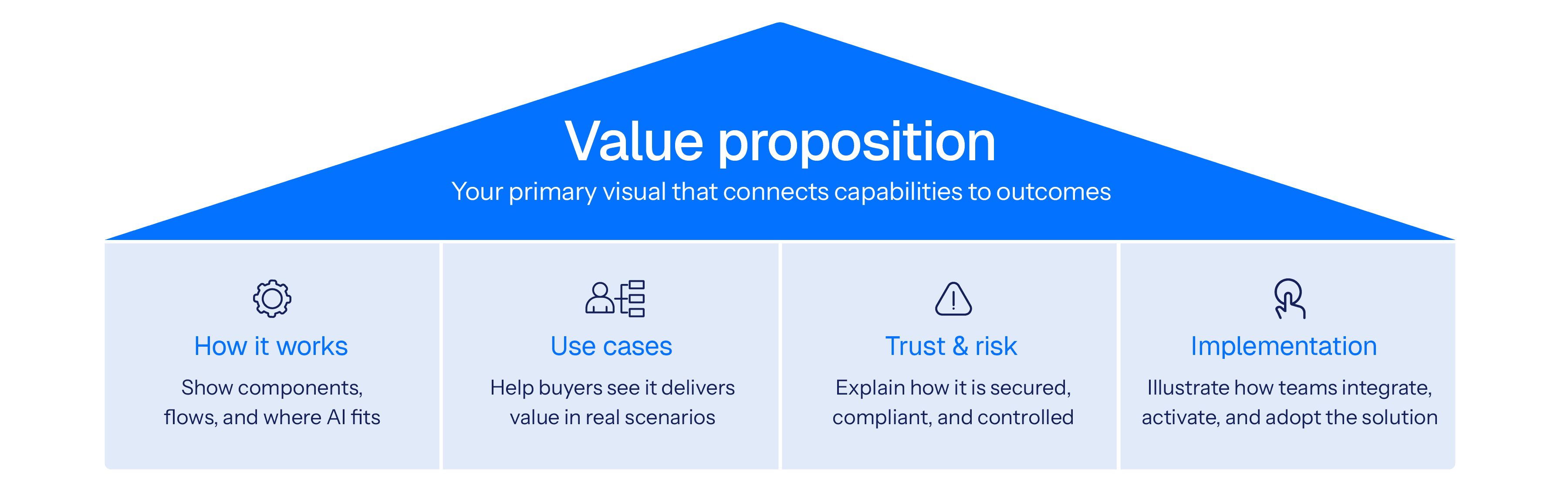
Visual Description: Visual library messaging house framework
To help determine which ones are required, here are some suggestions based on our experience marketing complex technology solutions:
1. Value proposition visuals
Show why the solution matters. If buyers only remember one image, it should be this one. It connects what the solution does to the outcomes buyers care about and gives them something they can confidently share in internal discussions.
2. Solution structure and how it works visuals
Help buyers understand how the solution is put together and how it works day to day. These images show the key components, the flow between them, and where the AI fits, without forcing buyers into technical detail they do not need.
3. Use case visuals
These visuals help buyers see how a solution can solve a specific use case scenario, such as in a particular industry vertical. For solutions with a wide variety of uses, it can help sales focus on buyers with specific high ROI scenarios.
4. Trust and risk visuals
Explain how the solution manages security, compliance, and risk. They help buyers see where controls exist, how risk is mitigated, and where human oversight remains in place.
5. Implementation visuals
Show what happens after the purchase decision is made. These images help buyers understand how the solution will be implemented and give internal champions a clear way to explain that plan to others.
When designed as a family, these visuals form a system that strengthens your message over time. When reused and recognized, they help buyers connect the dots more quickly and give teams a clearer, more consistent way to communicate.
Guide to building a strong visual library
So how do you get started? Below is a simple 5-step approach to building your visual library.
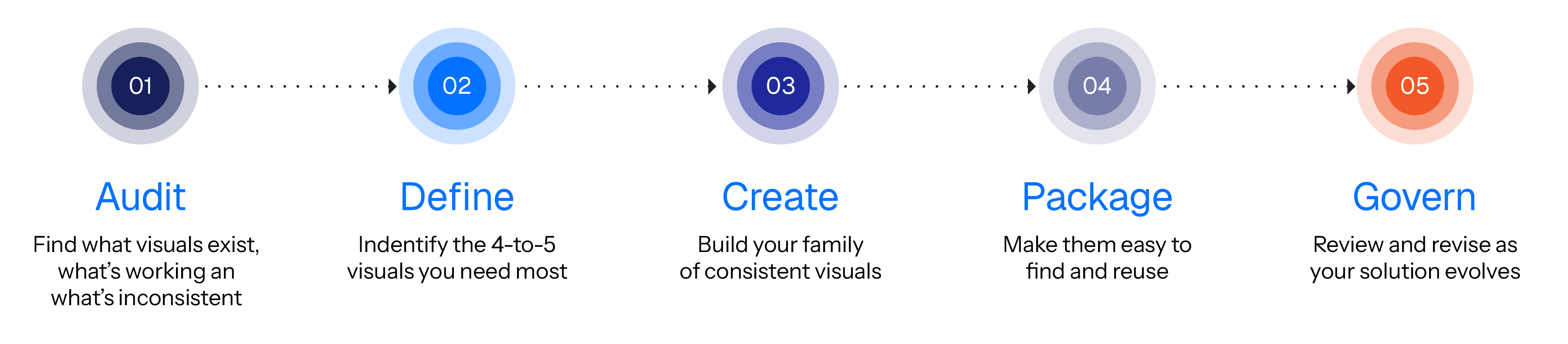
Visual Description: How to build your visual library framework – five simple steps to creating a family of consistent visuals to support your buyer understanding
Step 1: Audit what you already have
Marketing should start with a clear view of what exists today. Review decks, reports, web pages, one-pagers, and other assets to identify which visuals are in use, what they are meant to explain, and how consistently they communicate your message.
Look for:
Duplicated visuals that explain the same idea differently
Outdated diagrams or language
Assets that don’t match the current marketing narrative
Create a list with your observations and share it with your stakeholders.
Step 2: Define which visual assets are required
Once you understand what exists, shift the conversation to what is actually needed. Bring marketing together with sales, product, and communications to focus on the parts of the story that would benefit most from strong, repeatable visuals.
Guide the discussion with questions like:
Which parts of the value proposition are most important and need reinforcement?
What questions come up most often with buyers?
Where do buyers most often get confused?
Where does explanation tend to slow things down?
What needs to be easy to repeat across teams and channels?
From there, identify four or five core visuals that will do the most work across the buyer journey. Some may already exist and simply need refinement.
Step 3: Create or refine the core visuals
Each visual should make the solution easier to understand, not more complicated. Start with a short brief that clarifies what the visual needs to do.
What confusion does this visual resolve?
Who will use it?
What should someone understand within a few seconds?
Build early versions and refine them based on feedback from people who will actually use them in conversations.
Step 4: Package everything in one accessible place
Once the core visuals are ready, they need to live somewhere teams can trust. Think of the library as a shared briefing room where every visual explains itself quickly.
Each visual should be packaged with:
A clear, descriptive name (i.e. “Solution XYZ – How It Works visual”)
A version and date
A short description of what it shows
Why it matters to the buyer
Where it fits in the marketing and sales cycle
Suggested talking points
Once the library is live, adoption depends on how easy it is to use. A simple structure, straightforward instructions, and possibly a short walkthrough video can make it clear how visuals should be applied across the content portfolio being created.
Step 5: Govern, measure, and improve
A visual library is not a one-time project. As the story evolves, the visuals need to evolve with it. Clear ownership and a regular review cadence helps prevent ad hoc visuals from reappearing and keep the library aligned with the narrative over time.
Review it periodically to ensure it stays accurate and aligned with evolving narrative needs.
Track:
Reuse rates across campaigns and teams
Feedback from sales conversations
Signs of brand or narrative drift
Use insights to update outdated visuals, retire what no longer fits, and plan new assets for upcoming campaigns.
Consistency. Clarity. Confidence.
Imagine looking at your entire marketing and sales content portfolio for your new AI-empowered solution, and seeing the narrative connected, and supported, across all pieces with a consistent set of visual assets.
A visual library is a simple concept that can have a significant impact. It’s really just a matter of taking your core set of visuals as seriously as your messaging house. It takes some time to create them upfront, but creating the content portfolio afterwards will likely be faster than you expected.
When marketing complex technology, messaging clarity is a strategic advantage. A well-built visual library is one of the most effective ways marketing can eliminate buyer confusion and enable confident purchase decisions.
Frequently asked questions
Understanding why visuals matter in AI and complex B2B solutions
How can visuals help explain AI-enabled solutions?
Visuals can help explain AI-enabled solutions by showing a clear AI workflow, such as inputs, key steps, decision points, and outputs. A diagram can make system behavior easier to follow than text alone, especially for non-technical readers or buyer groups. For example, a simple flow diagram can show where AI is applied, where humans are part of the process, and what happens before and after it runs.
Why can consistent visuals support buyer confidence in AI-enabled solutions and complex technology?
Consistent visuals can support buyer confidence by keeping the explanation of an AI-enabled solution consistent across touchpoints, such as the website, sales deck, and product documentation. When the same diagram structure is reused, buyers are less likely to encounter conflicting interpretations or need to reinterpret the concept in each context. This can make the solution easier to understand and evaluate over time.
How can a visual library support B2B teams selling AI-enabled solutions?
A visual library can support B2B teams by providing a shared set of approved visuals for explaining AI-enabled solutions. This can reduce one-off diagram creation and limit inconsistent explanations across marketing, sales enablement, and product teams. While this does not guarantee a faster sales cycle, it can help reduce buyer confusion by providing a single, consistent reference that buyers can use as they discuss the solution internally.
Why can consistent visuals matter for complex B2B and AI-enabled solutions?
Consistent visuals can matter because complex B2B and AI-enabled solutions are reviewed by multiple stakeholders across multiple assets. Reusing a familiar visual structure can reduce interpretation effort and help buyer groups develop a shared understanding of what the solution does as details increase. For example, the same system diagram can appear in both a high-level overview and a deeper technical section.
Building alignment and measuring impact
How can a visual library support marketing and sales alignment?
A visual library can support marketing and sales alignment by acting as a shared reference for how the solution is explained visually. When teams use the same approved diagrams, they are less likely to describe the same capability in conflicting ways. This can reduce internal clarification cycles and improve consistency across channels.
How can visuals help buyers understand complex technologies and outcomes?
Visuals can help buyers understand complex technologies and outcomes by making relationships visible, such as how capabilities connect to results. A process diagram or system diagram can show the path from input to output, and where decisions happen. This can support conversations that link technical capability to business impact without relying on long explanations.
How can visual consistency support trust in B2B buying decisions?
Visual consistency can support trust in B2B buying decisions by making explanations feel stable across time and across teams. When the same visuals appear in multiple places, buyers may spend less time reconciling differences in how the solution is described. This can help buyers focus on evaluation rather than interpretation.
What metrics can be used to assess the impact of consistent visuals and a visual library?
Metrics can include visual reuse rate across assets, reduced time spent recreating diagrams, and qualitative feedback related to clarity from buyers or internal teams. Engagement signals, such as time on page or completion rates for visual-led content, can also provide directional insight without implying causation. Together, these measures focus on communication efficiency and shared understanding rather than direct revenue attribution.
About Author

Connect with him on LinkedIn and follow Altitude here. Questions or feedback? Contact our team or message us on LinkedIn.
CONTENT CREATION
/
Christopher Carson
5-minute read. Part of The AI visuals playbook, a three-part series on building a visual library, standardizing five core AI visuals, and creating credible visuals with your thought leaders. Easy to read in one sitting, and easy to share with a team.
Article at a glance
Standardize 3–5 core visuals that explain value, how it works (including where AI runs), use cases, trust and risk, and implementation.
Audit existing assets for competing diagrams, outdated visuals, and narrative drift.
Package each visual for reuse with a clear name, version/date, what it shows, where to use it, and optional talking points.
Assign ownership and a review cadence so the library stays accurate as the product and story evolve.
Track adoption and clarity signals, such as reuse rate, reduced rework, and feedback from sales and buyer conversations.
AI is now embedded in many B2B solutions, from data processing and decision support to workflow automation. These capabilities add real value, but they also introduce new questions for buyers, further adding to the complexity of technology purchase decisions. AI simply raises the stakes and the buyers confidence required to make those decisions.
Buyers want to understand how the solution works, how it is secured, how risk is managed, and where human oversight remains. Those questions are often explored by different stakeholders at different points in the buying process. When the marketing and sales materials they see are unclear or inconsistent, shared understanding breaks down.
One of the most common sources of confusion that we have witnessed within the technology sector is the inconsistency of visuals that depict the solution. The same solution is often represented in different ways across videos, product briefs, and pitch decks. Rather than reinforce the messages as buyers move from one content piece to another, these visuals can make the story harder to follow.
A visual library helps address this. It is a centralized, governed set of approved visuals that teams use consistently across marketing and sales materials. By developing key visuals upfront, teams can reduce buyer confusion, improve information retention, and give buyers a clearer path to understanding how the solution fits their needs.
This article outlines how to build a visual library that supports clearer communication, reduces cognitive load, and helps buying groups align around what matters most.
Why a visual library improves communication
Buyers don’t reward complexity; they reward understanding.
The rationale for a visual library is simple. By identifying the most challenging topics and visualizing them upfront:
Marketers can avoid recreating diagrams or introducing new variations of the same idea
Buyers benefit from consuming a consistent set of visuals that address their most pressing questions.
Research reinforces the value of this approach:
Almost 70% of B2B buyers report inconsistencies between what they viewed on a vendor's website and what sellers tell them.
This inconsistency highlights the need for a visual library that serves as a single source of truth, ensuring the same visual explanations are used consistently across marketing and sales touchpoints.
58% of marketers cite lack of time or staff as a challenge, attributed to activities like recreating existing visual assets; taking them away from higher-value strategic work.
This is why a visual library matters: it lets teams reuse and adapt proven visuals, reducing rework and one-off diagrams, and freeing time for higher-value strategic work.
The average B2B purchase now involves 13 stakeholders, and nearly 89% of buying decisions cross multiple departments.
As buying decisions span more stakeholders and functions, a visual library becomes essential for preserving shared understanding as ideas are communicated and re-communicated across the organization.
Taken together, these realities position a visual library as critical infrastructure for maintaining clarity, consistency, and efficiency throughout the B2B buying journey.
Types of visuals to create
A visual library does not need to be extensive. In many cases, three to five core visuals are enough. The visual library messaging house below shows how those visuals should work together, led by a clear value proposition and supported by visuals that explain how the solution works, where it applies, how risk is managed, and what implementation looks like. Together, they give buyers the context they need to understand the solution and move forward with confidence.
Visual Description: Visual library messaging house framework
To help determine which ones are required, here are some suggestions based on our experience marketing complex technology solutions:
1. Value proposition visuals
Show why the solution matters. If buyers only remember one image, it should be this one. It connects what the solution does to the outcomes buyers care about and gives them something they can confidently share in internal discussions.
2. Solution structure and how it works visuals
Help buyers understand how the solution is put together and how it works day to day. These images show the key components, the flow between them, and where the AI fits, without forcing buyers into technical detail they do not need.
3. Use case visuals
These visuals help buyers see how a solution can solve a specific use case scenario, such as in a particular industry vertical. For solutions with a wide variety of uses, it can help sales focus on buyers with specific high ROI scenarios.
4. Trust and risk visuals
Explain how the solution manages security, compliance, and risk. They help buyers see where controls exist, how risk is mitigated, and where human oversight remains in place.
5. Implementation visuals
Show what happens after the purchase decision is made. These images help buyers understand how the solution will be implemented and give internal champions a clear way to explain that plan to others.
When designed as a family, these visuals form a system that strengthens your message over time. When reused and recognized, they help buyers connect the dots more quickly and give teams a clearer, more consistent way to communicate.
Guide to building a strong visual library
So how do you get started? Below is a simple 5-step approach to building your visual library.
Visual Description: How to build your visual library framework – five simple steps to creating a family of consistent visuals to support your buyer understanding
Step 1: Audit what you already have
Marketing should start with a clear view of what exists today. Review decks, reports, web pages, one-pagers, and other assets to identify which visuals are in use, what they are meant to explain, and how consistently they communicate your message.
Look for:
Duplicated visuals that explain the same idea differently
Outdated diagrams or language
Assets that don’t match the current marketing narrative
Create a list with your observations and share it with your stakeholders.
Step 2: Define which visual assets are required
Once you understand what exists, shift the conversation to what is actually needed. Bring marketing together with sales, product, and communications to focus on the parts of the story that would benefit most from strong, repeatable visuals.
Guide the discussion with questions like:
Which parts of the value proposition are most important and need reinforcement?
What questions come up most often with buyers?
Where do buyers most often get confused?
Where does explanation tend to slow things down?
What needs to be easy to repeat across teams and channels?
From there, identify four or five core visuals that will do the most work across the buyer journey. Some may already exist and simply need refinement.
Step 3: Create or refine the core visuals
Each visual should make the solution easier to understand, not more complicated. Start with a short brief that clarifies what the visual needs to do.
What confusion does this visual resolve?
Who will use it?
What should someone understand within a few seconds?
Build early versions and refine them based on feedback from people who will actually use them in conversations.
Step 4: Package everything in one accessible place
Once the core visuals are ready, they need to live somewhere teams can trust. Think of the library as a shared briefing room where every visual explains itself quickly.
Each visual should be packaged with:
A clear, descriptive name (i.e. “Solution XYZ – How It Works visual”)
A version and date
A short description of what it shows
Why it matters to the buyer
Where it fits in the marketing and sales cycle
Suggested talking points
Once the library is live, adoption depends on how easy it is to use. A simple structure, straightforward instructions, and possibly a short walkthrough video can make it clear how visuals should be applied across the content portfolio being created.
Step 5: Govern, measure, and improve
A visual library is not a one-time project. As the story evolves, the visuals need to evolve with it. Clear ownership and a regular review cadence helps prevent ad hoc visuals from reappearing and keep the library aligned with the narrative over time.
Review it periodically to ensure it stays accurate and aligned with evolving narrative needs.
Track:
Reuse rates across campaigns and teams
Feedback from sales conversations
Signs of brand or narrative drift
Use insights to update outdated visuals, retire what no longer fits, and plan new assets for upcoming campaigns.
Consistency. Clarity. Confidence.
Imagine looking at your entire marketing and sales content portfolio for your new AI-empowered solution, and seeing the narrative connected, and supported, across all pieces with a consistent set of visual assets.
A visual library is a simple concept that can have a significant impact. It’s really just a matter of taking your core set of visuals as seriously as your messaging house. It takes some time to create them upfront, but creating the content portfolio afterwards will likely be faster than you expected.
When marketing complex technology, messaging clarity is a strategic advantage. A well-built visual library is one of the most effective ways marketing can eliminate buyer confusion and enable confident purchase decisions.
Frequently asked questions
Understanding why visuals matter in AI and complex B2B solutions
How can visuals help explain AI-enabled solutions?
Visuals can help explain AI-enabled solutions by showing a clear AI workflow, such as inputs, key steps, decision points, and outputs. A diagram can make system behavior easier to follow than text alone, especially for non-technical readers or buyer groups. For example, a simple flow diagram can show where AI is applied, where humans are part of the process, and what happens before and after it runs.
Why can consistent visuals support buyer confidence in AI-enabled solutions and complex technology?
Consistent visuals can support buyer confidence by keeping the explanation of an AI-enabled solution consistent across touchpoints, such as the website, sales deck, and product documentation. When the same diagram structure is reused, buyers are less likely to encounter conflicting interpretations or need to reinterpret the concept in each context. This can make the solution easier to understand and evaluate over time.
How can a visual library support B2B teams selling AI-enabled solutions?
A visual library can support B2B teams by providing a shared set of approved visuals for explaining AI-enabled solutions. This can reduce one-off diagram creation and limit inconsistent explanations across marketing, sales enablement, and product teams. While this does not guarantee a faster sales cycle, it can help reduce buyer confusion by providing a single, consistent reference that buyers can use as they discuss the solution internally.
Why can consistent visuals matter for complex B2B and AI-enabled solutions?
Consistent visuals can matter because complex B2B and AI-enabled solutions are reviewed by multiple stakeholders across multiple assets. Reusing a familiar visual structure can reduce interpretation effort and help buyer groups develop a shared understanding of what the solution does as details increase. For example, the same system diagram can appear in both a high-level overview and a deeper technical section.
Building alignment and measuring impact
How can a visual library support marketing and sales alignment?
A visual library can support marketing and sales alignment by acting as a shared reference for how the solution is explained visually. When teams use the same approved diagrams, they are less likely to describe the same capability in conflicting ways. This can reduce internal clarification cycles and improve consistency across channels.
How can visuals help buyers understand complex technologies and outcomes?
Visuals can help buyers understand complex technologies and outcomes by making relationships visible, such as how capabilities connect to results. A process diagram or system diagram can show the path from input to output, and where decisions happen. This can support conversations that link technical capability to business impact without relying on long explanations.
How can visual consistency support trust in B2B buying decisions?
Visual consistency can support trust in B2B buying decisions by making explanations feel stable across time and across teams. When the same visuals appear in multiple places, buyers may spend less time reconciling differences in how the solution is described. This can help buyers focus on evaluation rather than interpretation.
What metrics can be used to assess the impact of consistent visuals and a visual library?
Metrics can include visual reuse rate across assets, reduced time spent recreating diagrams, and qualitative feedback related to clarity from buyers or internal teams. Engagement signals, such as time on page or completion rates for visual-led content, can also provide directional insight without implying causation. Together, these measures focus on communication efficiency and shared understanding rather than direct revenue attribution.
About Author
Connect with him on LinkedIn and follow Altitude here. Questions or feedback? Contact our team or message us on LinkedIn.

CONTENT STRATEGY
/
Christopher Carson
In a hurry, drop this article in AI and ask it to summarize it for you to help you apply the learnings to your unique challenge.
Messaging clarity is one of the strongest levers for moving buyers through a buyer journey. When each stage delivers the right information in the right way, it reduces the risk of confusion and helps prospects decide faster. Yet, 61% of B2B marketers say creating content that appeals to multiple stages of the journey remains a top challenge.
Friction in a B2B buyer’s journey refers to any obstacle that slows down or discourage buyers, such as unclear messaging, hard-to-find information, or overly technical content, among other barriers. Reducing friction helps buyers move smoothly from awareness through to purchase.
This article will cover:
Building trust in the awareness stage – making content simple, memorable, and framed around buyer priorities.
Clarifying choices in the consideration stage – sharpening value propositions, tailoring by role, and keeping your story consistent across channels.
Removing barriers in the decision stage – reducing risk with proof, aligning proposals to the story buyers already know, and equipping champions with a repeatable narrative.
Awareness stage: building trust from the first interaction
The awareness stage is your first chance to make an impression. Buyers here are looking for clarity and relevance, not technical detail. As Bryan Reid, CEO of Altitude, emphasizes, “The first interaction sets the tone. Keeping the content simple, brief and relevant makes it more inviting, and encourages buyers to learn more.”
Simplicity over technical language
Not every buyer is technical. Leaders in finance, operations, or strategy often need a clear, high-level explanation before they’ll engage further. Content that leads with jargon or detailed specs risks shutting those doors too soon. If your content can’t be understood by a non-specialist, it may never reach the stakeholders who influence the decision.
Actionable steps:
Scrub jargon. Take your homepage, one-pager, and explainer video. Highlight every acronym or technical term that isn’t universally understood by your buying group. Replace each with a simple phrase or analogy (e.g., instead of “data orchestration,” say “software that automatically coordinates your data flows across systems”).
Build role-neutral assets. Write a 150-word “solution in plain English” summary. Use it in top-funnel guides or videos targeted at finance, operations, or strategy leaders. Keep specs in a separate technical sheet.
Test with non-specialists. Run a quick exercise: ask three colleagues outside product/engineering to read your overview. If they can summarize your value in one sentence, it’s ready. If not, simplify further.
Crafting buyer-centric messaging
Buyers want to see their own priorities reflected in your words. If they don’t, even the best product feels distant. At this stage, the goal is simple: make your content about their challenges, not your features.
Actionable steps:
Rewrite feature-first lines. Pick three assets (web page, sales deck, blog). Circle every feature statement. Rewrite each to finish with “so that [buyer goal]” (e.g., “Automates reporting so finance leaders close faster each quarter”).
Build industry briefs. Create one-pagers for your top 2–3 industries listing common challenges and preferred terms. Share with writers and sales to guide tone.
Check with sales. After each campaign, ask reps which buyer questions came up most. Add those words directly into the next round of content.
Setting the right narrative early
In a crowded market, most solutions blur together. Without a distinct narrative, buyers will struggle to explain how your solution is different. A single, memorable line supported by an external insight gives them the story they’ll carry inside their company.
Actionable steps:
Start with a signal. Start awareness assets with one credible stat or analyst finding (e.g., “80% of CFOs say compliance risk is rising”). Use it to frame why the problem matters now.
Write a bold line. Draft one bold sentence that captures your unique POV (e.g., “Security isn’t about compliance, it’s about buyer trust”). Use it consistently across homepage copy, campaign headlines, and sales decks.
Anchor with credibility. Place a validating stat, analyst quote, or mini case study directly under your narrative line. This makes it easy for buyers to repeat your story internally.
Consideration stage: clarifying choices to inspire buyer confidence
At the consideration stage, your buyers actively compare and evaluate options. Clear, relevant content is critical in empowering confident, informed decisions. Bryan notes, "Clarity and relevance is essential. Buyers trust brands that simplify complex choices."
Alignment around value propositions
At this stage, buyers are weighing you against competitors. Friction arises when your claims sound generic — the same “cost savings” and “efficiency” promises everyone else makes. Value propositions need to show how you’re different.
Actionable steps:
Map against competitors. Review your top three value props alongside competitor sites or decks. Highlight overlaps where you risk blending in.
Sharpen by adding contrast. Rewrite generic claims to show either how you deliver outcomes without added costs or trade-offs (e.g., “Reduce onboarding time by 40% without adding headcount”) or by using a unique method that competitors can’t match (e.g., “Shorten sales cycles to 60 days by automating proposal workflows”).
Use exclusive proof. Pair each value prop with differentiators others can’t easily replicate — unique ROI data, benchmarks, or customer results. Example: Instead of saying “improves efficiency,” highlight that “Our platform helped [Client X] cut invoice processing costs by 32%, validated through a third-party benchmark study.”
Role-specific relevance
In most B2B deals, six to ten people weigh in — and they rarely share the same priorities (Gartner, 2023). Treating the buying group as one persona creates friction. Messaging should flex so each role hears the value in their terms.
Actionable steps:
Break down priorities by role. Create a one-page grid listing each key stakeholder (Finance, IT, Operations, Procurement) with their top concern and success metric.
Adapt messaging by audience. For each role, rewrite one version of your core value prop in their terms (e.g., Finance = ROI, IT = security, Ops = efficiency).
Equip sales with tailored content. Provide modular slides or one-pagers for each role so sales teams can pull the right validation points into multi-stakeholder discussions.
Consistent messaging across all channels
Buyers notice when your story changes between the website, a webinar, and a sales deck — and it creates doubt. Mid-journey consistency builds confidence that your team is aligned. The fix is simple guardrails.
Actionable steps:
Create a message map. Capture your three core value propositions, two supporting evidence points, and a short positioning statement. Share it as the “source of truth” with marketing, sales, and leadership.
Audit channels quarterly. Pick one asset from each channel (web page, sales deck, webinar, email). Compare headlines and value props to your map. Where words drift, update copy or retrain teams to bring them back in sync.
Build consistency in workflows. Add the message map into templates, content briefs, and sales enablement tools (like email sequences or pitch decks). This ensures every new asset starts aligned rather than being “fixed” later.
By executing these steps, you make it easier for buyers to compare options, see your distinct value, and move forward with confidence.
Decision stage: empowering confident buyer decisions
At the decision stage, your prospects are ready to choose—but they need reassurance and clear evidence to finalize their selection confidently.
Clear proof and reassurance content
By the final stage, buyers already believe your solution works — the question is whether it will work for them with minimal risk. Friction comes from doubts about adoption, integration, or ROI. Content here should reassure buyers that the leap is safe. Without this evidence, 40–60% of B2B buying decisions can stall due to uncertainty about outcomes.
Actionable steps:
Mirror their world. Create one case study that mirrors the buyer’s size, industry, and challenge. Highlight implementation speed, adoption, and results within the first 90 days.
Add risk-reduction guarantees. Provide evidence of smooth rollouts (e.g., implementation timelines, customer support metrics, uptime guarantees) so buyers see low risk in moving forward.
Hand them a business case. Develop a one-page “business case” template that buyers can use internally — including ROI, risk mitigation, and expected payback period — so they can justify the choice to leadership.
Consistent last-mile messaging
Deals can stall if the proposal or contract introduces new terms, language, or promises. At this stage, consistency isn’t about channels — it’s about closing integrity. Buyers should see the same story from the first deck to the final signature.
Actionable steps:
Audit closing docs. Compare your standard proposal deck and contract templates to the message map. Make sure value props, assurance points, and even phrasing mirror what buyers saw earlier.
Enforce “no surprises” rule. Establish internal guardrails that prevent late-stage additions — like new fees, disclaimers, or bold claims that weren’t supported upstream.
Spot-check live deals. Audit a few live proposals or late-stage decks against marketing’s framework. Flag any drift, and coach reps on how to keep language aligned.
Equipping champions with the right story
Champions carry your message when you’re not in the room. If they can’t retell it clearly, momentum stalls. Give them a simple, repeatable story they can share across finance, IT, and leadership.
Actionable steps:
Write a champion brief. Build a one-page summary with three talking points: the problem you solve, how you solve it differently, and evidence it works. Keep it in plain language so non-specialists can share it easily.
Prepare for pushback. Provide a short FAQ or objection handler with simple responses to common pushbacks (cost, integration, risk). This makes champions more confident in defending your solution.
Design role-specific snippets. Give champions modular credibility anchors they can drop into conversations — an ROI stat for finance, a security example for IT, an efficiency win for operations.
By delivering assurance, alignment, and advocacy, you give buyers the certainty they need to finalize their decision decisively.
Accelerate your journey by removing hidden friction
Reducing hidden frictions across the buyer journey isn’t about rewriting everything — it’s about sharpening how you communicate at each stage.
In Awareness, simplicity, buyer-first messaging, and a clear narrative make you memorable and easy to understand.
In Consideration, sharper value props, role-based relevance, and consistent messaging help buyers see why your solution is distinct.
In Decision, risk-reducing proof, closing alignment, and empowering champions remove the final barriers to signing.
By tackling these frictions, you create a buyer experience that feels clear, credible, and easy to advance. Every stage becomes smoother, deals move faster, and your team gains a repeatable structure for telling the right story at the right time.
Now is the time to review your buyer's journey, strengthen each stage, and give buyers fewer reasons to hesitate — and more reasons to say yes.
Frequently Asked Questions
Q1. What is friction in a B2B marketing journey?
A: Friction in a B2B buyer journeys refers to barriers that slow buyers, such as unclear messaging, gated resources, or inconsistent content. Removing friction improves buyer flow from awareness to purchase.
Q2. How do you reduce content friction in the buyer’s journey?
A: Reduce content friction by simplifying messaging, aligning value propositions, tailoring content to multiple stakeholders, and offering risk-reducing proof at the decision stage.
Q3. Why is messaging alignment important in B2B marketing?
A: Messaging alignment ensures sales, marketing, and product tell the same story. Consistency builds credibility, clarifies differentiation, and helps buyers move smoothly through the funnel.
Q4. What content is most important in the consideration stage?
A: In the consideration stage, content should highlight distinct value propositions, adapt messages to roles like finance or IT, and stay consistent across all channels so buyers can compare options clearly.
Q5. What is the role of internal champions in B2B sales?
A: Internal champions advocate for your solution within the buying group. Giving them simple briefs, objection-handling FAQs, and role-specific proof points helps them carry your message and reduce resistance.
Author Bio

Connect with him on LinkedIn and follow Altitude here. Questions or feedback? Contact our team or message us on LinkedIn.
CONTENT STRATEGY
/
Christopher Carson
In a hurry, drop this article in AI and ask it to summarize it for you to help you apply the learnings to your unique challenge.
Messaging clarity is one of the strongest levers for moving buyers through a buyer journey. When each stage delivers the right information in the right way, it reduces the risk of confusion and helps prospects decide faster. Yet, 61% of B2B marketers say creating content that appeals to multiple stages of the journey remains a top challenge.
Friction in a B2B buyer’s journey refers to any obstacle that slows down or discourage buyers, such as unclear messaging, hard-to-find information, or overly technical content, among other barriers. Reducing friction helps buyers move smoothly from awareness through to purchase.
This article will cover:
Building trust in the awareness stage – making content simple, memorable, and framed around buyer priorities.
Clarifying choices in the consideration stage – sharpening value propositions, tailoring by role, and keeping your story consistent across channels.
Removing barriers in the decision stage – reducing risk with proof, aligning proposals to the story buyers already know, and equipping champions with a repeatable narrative.
Awareness stage: building trust from the first interaction
The awareness stage is your first chance to make an impression. Buyers here are looking for clarity and relevance, not technical detail. As Bryan Reid, CEO of Altitude, emphasizes, “The first interaction sets the tone. Keeping the content simple, brief and relevant makes it more inviting, and encourages buyers to learn more.”
Simplicity over technical language
Not every buyer is technical. Leaders in finance, operations, or strategy often need a clear, high-level explanation before they’ll engage further. Content that leads with jargon or detailed specs risks shutting those doors too soon. If your content can’t be understood by a non-specialist, it may never reach the stakeholders who influence the decision.
Actionable steps:
Scrub jargon. Take your homepage, one-pager, and explainer video. Highlight every acronym or technical term that isn’t universally understood by your buying group. Replace each with a simple phrase or analogy (e.g., instead of “data orchestration,” say “software that automatically coordinates your data flows across systems”).
Build role-neutral assets. Write a 150-word “solution in plain English” summary. Use it in top-funnel guides or videos targeted at finance, operations, or strategy leaders. Keep specs in a separate technical sheet.
Test with non-specialists. Run a quick exercise: ask three colleagues outside product/engineering to read your overview. If they can summarize your value in one sentence, it’s ready. If not, simplify further.
Crafting buyer-centric messaging
Buyers want to see their own priorities reflected in your words. If they don’t, even the best product feels distant. At this stage, the goal is simple: make your content about their challenges, not your features.
Actionable steps:
Rewrite feature-first lines. Pick three assets (web page, sales deck, blog). Circle every feature statement. Rewrite each to finish with “so that [buyer goal]” (e.g., “Automates reporting so finance leaders close faster each quarter”).
Build industry briefs. Create one-pagers for your top 2–3 industries listing common challenges and preferred terms. Share with writers and sales to guide tone.
Check with sales. After each campaign, ask reps which buyer questions came up most. Add those words directly into the next round of content.
Setting the right narrative early
In a crowded market, most solutions blur together. Without a distinct narrative, buyers will struggle to explain how your solution is different. A single, memorable line supported by an external insight gives them the story they’ll carry inside their company.
Actionable steps:
Start with a signal. Start awareness assets with one credible stat or analyst finding (e.g., “80% of CFOs say compliance risk is rising”). Use it to frame why the problem matters now.
Write a bold line. Draft one bold sentence that captures your unique POV (e.g., “Security isn’t about compliance, it’s about buyer trust”). Use it consistently across homepage copy, campaign headlines, and sales decks.
Anchor with credibility. Place a validating stat, analyst quote, or mini case study directly under your narrative line. This makes it easy for buyers to repeat your story internally.
Consideration stage: clarifying choices to inspire buyer confidence
At the consideration stage, your buyers actively compare and evaluate options. Clear, relevant content is critical in empowering confident, informed decisions. Bryan notes, "Clarity and relevance is essential. Buyers trust brands that simplify complex choices."
Alignment around value propositions
At this stage, buyers are weighing you against competitors. Friction arises when your claims sound generic — the same “cost savings” and “efficiency” promises everyone else makes. Value propositions need to show how you’re different.
Actionable steps:
Map against competitors. Review your top three value props alongside competitor sites or decks. Highlight overlaps where you risk blending in.
Sharpen by adding contrast. Rewrite generic claims to show either how you deliver outcomes without added costs or trade-offs (e.g., “Reduce onboarding time by 40% without adding headcount”) or by using a unique method that competitors can’t match (e.g., “Shorten sales cycles to 60 days by automating proposal workflows”).
Use exclusive proof. Pair each value prop with differentiators others can’t easily replicate — unique ROI data, benchmarks, or customer results. Example: Instead of saying “improves efficiency,” highlight that “Our platform helped [Client X] cut invoice processing costs by 32%, validated through a third-party benchmark study.”
Role-specific relevance
In most B2B deals, six to ten people weigh in — and they rarely share the same priorities (Gartner, 2023). Treating the buying group as one persona creates friction. Messaging should flex so each role hears the value in their terms.
Actionable steps:
Break down priorities by role. Create a one-page grid listing each key stakeholder (Finance, IT, Operations, Procurement) with their top concern and success metric.
Adapt messaging by audience. For each role, rewrite one version of your core value prop in their terms (e.g., Finance = ROI, IT = security, Ops = efficiency).
Equip sales with tailored content. Provide modular slides or one-pagers for each role so sales teams can pull the right validation points into multi-stakeholder discussions.
Consistent messaging across all channels
Buyers notice when your story changes between the website, a webinar, and a sales deck — and it creates doubt. Mid-journey consistency builds confidence that your team is aligned. The fix is simple guardrails.
Actionable steps:
Create a message map. Capture your three core value propositions, two supporting evidence points, and a short positioning statement. Share it as the “source of truth” with marketing, sales, and leadership.
Audit channels quarterly. Pick one asset from each channel (web page, sales deck, webinar, email). Compare headlines and value props to your map. Where words drift, update copy or retrain teams to bring them back in sync.
Build consistency in workflows. Add the message map into templates, content briefs, and sales enablement tools (like email sequences or pitch decks). This ensures every new asset starts aligned rather than being “fixed” later.
By executing these steps, you make it easier for buyers to compare options, see your distinct value, and move forward with confidence.
Decision stage: empowering confident buyer decisions
At the decision stage, your prospects are ready to choose—but they need reassurance and clear evidence to finalize their selection confidently.
Clear proof and reassurance content
By the final stage, buyers already believe your solution works — the question is whether it will work for them with minimal risk. Friction comes from doubts about adoption, integration, or ROI. Content here should reassure buyers that the leap is safe. Without this evidence, 40–60% of B2B buying decisions can stall due to uncertainty about outcomes.
Actionable steps:
Mirror their world. Create one case study that mirrors the buyer’s size, industry, and challenge. Highlight implementation speed, adoption, and results within the first 90 days.
Add risk-reduction guarantees. Provide evidence of smooth rollouts (e.g., implementation timelines, customer support metrics, uptime guarantees) so buyers see low risk in moving forward.
Hand them a business case. Develop a one-page “business case” template that buyers can use internally — including ROI, risk mitigation, and expected payback period — so they can justify the choice to leadership.
Consistent last-mile messaging
Deals can stall if the proposal or contract introduces new terms, language, or promises. At this stage, consistency isn’t about channels — it’s about closing integrity. Buyers should see the same story from the first deck to the final signature.
Actionable steps:
Audit closing docs. Compare your standard proposal deck and contract templates to the message map. Make sure value props, assurance points, and even phrasing mirror what buyers saw earlier.
Enforce “no surprises” rule. Establish internal guardrails that prevent late-stage additions — like new fees, disclaimers, or bold claims that weren’t supported upstream.
Spot-check live deals. Audit a few live proposals or late-stage decks against marketing’s framework. Flag any drift, and coach reps on how to keep language aligned.
Equipping champions with the right story
Champions carry your message when you’re not in the room. If they can’t retell it clearly, momentum stalls. Give them a simple, repeatable story they can share across finance, IT, and leadership.
Actionable steps:
Write a champion brief. Build a one-page summary with three talking points: the problem you solve, how you solve it differently, and evidence it works. Keep it in plain language so non-specialists can share it easily.
Prepare for pushback. Provide a short FAQ or objection handler with simple responses to common pushbacks (cost, integration, risk). This makes champions more confident in defending your solution.
Design role-specific snippets. Give champions modular credibility anchors they can drop into conversations — an ROI stat for finance, a security example for IT, an efficiency win for operations.
By delivering assurance, alignment, and advocacy, you give buyers the certainty they need to finalize their decision decisively.
Accelerate your journey by removing hidden friction
Reducing hidden frictions across the buyer journey isn’t about rewriting everything — it’s about sharpening how you communicate at each stage.
In Awareness, simplicity, buyer-first messaging, and a clear narrative make you memorable and easy to understand.
In Consideration, sharper value props, role-based relevance, and consistent messaging help buyers see why your solution is distinct.
In Decision, risk-reducing proof, closing alignment, and empowering champions remove the final barriers to signing.
By tackling these frictions, you create a buyer experience that feels clear, credible, and easy to advance. Every stage becomes smoother, deals move faster, and your team gains a repeatable structure for telling the right story at the right time.
Now is the time to review your buyer's journey, strengthen each stage, and give buyers fewer reasons to hesitate — and more reasons to say yes.
Frequently Asked Questions
Q1. What is friction in a B2B marketing journey?
A: Friction in a B2B buyer journeys refers to barriers that slow buyers, such as unclear messaging, gated resources, or inconsistent content. Removing friction improves buyer flow from awareness to purchase.
Q2. How do you reduce content friction in the buyer’s journey?
A: Reduce content friction by simplifying messaging, aligning value propositions, tailoring content to multiple stakeholders, and offering risk-reducing proof at the decision stage.
Q3. Why is messaging alignment important in B2B marketing?
A: Messaging alignment ensures sales, marketing, and product tell the same story. Consistency builds credibility, clarifies differentiation, and helps buyers move smoothly through the funnel.
Q4. What content is most important in the consideration stage?
A: In the consideration stage, content should highlight distinct value propositions, adapt messages to roles like finance or IT, and stay consistent across all channels so buyers can compare options clearly.
Q5. What is the role of internal champions in B2B sales?
A: Internal champions advocate for your solution within the buying group. Giving them simple briefs, objection-handling FAQs, and role-specific proof points helps them carry your message and reduce resistance.
Author Bio
Connect with him on LinkedIn and follow Altitude here. Questions or feedback? Contact our team or message us on LinkedIn.
CONTENT CREATION
/
Bryan Reid
5-minute read. Stop over-explaining complex solutions. Use picture-book principles: plain words, visuals that show structure, and consistent cues across every asset. This article will show why plain language and consistent visuals keep the story stable across a buying group.
Article at a glance
Buying decisions involve many stakeholders and most learning happens without the vendor present, so your story has to stay consistent across the group.
Use plain language so different roles don’t walk away with different interpretations of the same solution.
Use visuals that do the organizing so buyers can see how pieces connect without having to imagine it from text.
Keep visual cues consistent across assets so buyers don’t have to relearn the story every time they switch pages, formats, or revisit later.
According to Forrester, B2B purchase decisions now require alignment across an average of 13 stakeholders. That’s 13 people who need to agree on what a solution does, what it helps them achieve, and why it’s worth the effort. Yet buyers typically spend 83% of their time researching solutions on their own, and only 17% of their time meeting with potential suppliers.
As a result, marketing and sales need to make their robust (i.e. complex) technology solutions and their myriad of benefits:
easy to understand for each individual buyer
easy to agree upon, across the buying group
Unfortunately, what we often see are marketers relying too heavily on complex language and not taking advantage of the power of effective, consistent visuals to explain the value of their solutions and how they work.
This may sound strange, but we think there are lessons to be learned from the simplicity of children’s picture books and their effective use of both plain language AND relevant visuals. Their ability to tell a story from beginning to end, in an easy-to-understand way, is something we as B2B marketers should aspire to.
Plain language minimizes risk
B2B marketing teams often try to say too much to cover every capability and avoid leaving anything out. This results in long, complex sentences that can’t be easily understood. Here’s an anonymized example from a cloud product brief:
“XYZ is a platform and broad set of distributed cloud and edge computing services, including virtual machines, graphical processing units, cloud storage and databases, network optimization and security services, and lightweight serverless functions to help businesses build, deploy, and manage applications and workloads on the world’s most distributed network.”
Sentences like this are asking a lot of the reader in one pass. It’s not just long. It packs seven distinct items into one sentence. It’s easy to see how different members of a buying group who are consuming content like this could get confused and form widely different perspectives on the solution’s value.
Children’s picture book authors in contrast work under different constraints. Holding a child’s attention is not easy, and many books are 500 words or less, which forces every line to earn its place. The language has to be immediately understood, or the story breaks. What parent wants to read a story that leaves their child confused and constantly asking questions? That same discipline matters in B2B marketing because buying groups need to agree on many key points before they can make a decision.
We’re not advocating for B2B content to be written for a three-year-old, but we do think it’s worth asking:
Will ALL buyers immediately understand what this means?
Is there a simpler way to say this, to avoid the risk of confusion or misunderstanding?
Clear, consistent visuals help carry the story
One of the reasons we think B2B content contains so much complex language is that marketers are:
asking their readers to do all the work
asking too little from their visual elements
It results in too much information, not enough showing.
Here is an anonymized example of what that can look like in a cybersecurity brief:
“XYZ’s visualization capabilities further enhance visibility with dynamic, interactive graphical representations of the security landscape. These maps illustrate asset relationships, potential attack paths, and threat spread...”
First, this could be more simply written as: “Visualizing XYZ as a map helps illustrate relationships between assets”. But if it’s only described in text, the reader has to picture it for themself: the graphical representation of the security landscape, asset relationships, attack paths, etc. The odds of all stakeholders imagining the same thing are zero.
Children’s picture books take a completely different approach. Because of the audience and the word constraints, the images HAVE to carry much of the story and show how the pieces fit together. The words guide attention to what matters without trying to explain everything. When words and visuals work together that way, the reader can SEE how elements relate and the story stays consistent as it moves forward. This is an old one, but this illustration from Richard Scarry’s “What Do People Do All Day?” does a better job of explaining the various systems in a typical home than probably 90% of home improvement books.
Richard Scarry shows how to make a complex system easy to follow.
Source: Richard Scarry’s What Do People Do All Day?, written and illustrated by Richard Scarry (Random House Children’s Books, 1968), p. 13. Reduced-size excerpt reproduced here for review of how labels and colour make a complex system easy to follow.
What to notice: This illustration shows the different systems in a typical house, and it’s easy to follow each one because the labels and colors make the connections obvious.
Why it matters: The connections are visible, so the reader doesn’t have to piece it together from paragraphs.
That page highlights two things picture books do well, and they’re directly relevant to B2B content:
The imagery is designed for the audience’s ability, so recognition is immediate.
What matters is emphasized visually, so the reader doesn’t have to decide what to focus on.
In contrast, we often see detailed B2B diagrams that leave the buyer to figure out what matters and how things connect, which can easily lead to misinterpretation.
A third thing picture books do well is ensure that the imagery is consistent throughout the book. The same character, or scene is immediately recognizable from beginning to end.
Here’s a simple example of this consistency I mentioned in an earlier post.
Gossie & Gertie shows how consistent cues make recognition effortless.
Source: Gossie & Gertie, written and illustrated by Olivier Dunrea (Clarion Books, 2002), cover and selected interior pages. Reduced-size excerpts reproduced here for review of how repeated visual cues support fast character recognition.
What to notice: Simple cues are called out and reused across pages. Gossie has red boots. Gertie has blue boots. When I mentioned this concept to a client recently, she knew exactly what I meant and recited it immediately: “Gossie has red boots. Gertie has blue boots.”
Why it matters: The reader doesn’t pause to interpret who they’re looking at. The cue does the work.
In B2B visuals, consistent labels, icons, and visual cues play the same role. They reduce re-learning and make it easier for a buying group to stay aligned on what they’re seeing.
When visuals help buyers connect information throughout an asset, words no longer need to carry the whole story on their own
Consistent visuals across assets reduce relearning
One final advantage picture books offer is continuity. When a reader picks up the next book in a series, the world feels familiar right away. They don’t have to relearn who is who or how to read the page before the story can move forward.
That’s the core takeaway for B2B. Buyers rarely consume content all at once. They return later and bring others into the conversation. When key concepts look the same every time they appear, it becomes easier to:
remember what they learned previously
incorporate what’s new
share the story with their buying peers
Here’s a simple example of what this looks like in practice.
Winnie-the-Pooh shows how series consistency prevents resets.
Source: Winnie-the-Pooh: The Complete Collection of Stories and Poems, by A. A. Milne, illustrated by E. H. Shepard (Egmont UK Ltd, 2001), slipcase and selected interior pages. Reduced-size excerpts reproduced here for review of how recurring characters and visual style create continuity across a series.
What to notice: The characters and visual style stay consistent across the series, so each book feels familiar the moment you open it.
Why it matters: The reader doesn’t have to reorient before they can start learning new information. They recognize what they’re looking at immediately.
In B2B content, we often see the opposite, usually because assets are created by different teams or agencies at different times. The visuals on the website don’t match the images in briefs and pitch decks, and the explainer video introduces a different set of cues again. Each asset might be clear on its own, but together they don’t help the buyer carry what they’ve already learned to this new asset they’re consuming. Relearning is slow. Recognition is fast.
This isn’t anyone’s fault. But it does mean we’re asking prospects to do more mental work than necessary and increasing the likelihood of misalignment across the buying group.
Credit: AT&T-Zscaler Infographic, Case Study, and Whitepaper Report, designed by Altitude.
In contrast, here’s an example of where we leveraged a ‘blueprint’ graphic about Zero Trust across an infographic, case study, and whitepaper, to help buyers build upon their learning as they move from asset to asset.
Three lessons to remember
When it comes to creating B2B content about complex solutions, picture books remind us of three approaches that can improve individual buyer understanding and increase alignment across multiple stakeholders:
use plain language that’s easy for all stakeholders to understand
incorporate clear visuals that can help carry the story
ensure your visuals are consistent across assets, to improve recognition and reduce the need for relearning
In the end, we want our buyers to experience the same feeling as children at the end of our stories. They understood it, and they liked what they learned. They want to learn more.
Frequently asked questions
1) How many people are involved in an enterprise B2B buying decision today?
On average, 13 people are involved in the buying decision, and 89% of purchases involve two or more departments (Forrester, 2024). That means your story has to hold across roles, not just resonate with one stakeholder.
2) What does it mean that B2B buyers spend only 17% of their time meeting suppliers?
Gartner reports buyers typically spend only 17% of their time meeting with potential suppliers (Gartner, 2020). The practical implication is that most evaluation happens outside supplier meetings, across content and internal conversations, so buyers form their understanding from assets they consume on their own.
3) Why do buying groups end up with different interpretations of the same B2B solution?
Because stakeholders learn independently and bring different context to what they read. When key relationships are only explained in text, people fill gaps differently and carry different versions of the story into internal discussions, which slows alignment.
4) How do you simplify B2B product messaging without “dumbing it down”?
Use plain language that reduces interpretation. The goal is not less substance. It’s fewer stacked sentences that pack too many distinct ideas into one pass. Plain language makes it easier for different roles to take away the same meaning before they ever see a visual.
5) What are the “picture book for adults” principles for B2B content?
Picture books work because they remove guesswork and keep meaning stable as the story moves. In B2B, that translates to three principles:
Plain language that lands quickly across roles
Visuals that do the organizing by showing how pieces connect
Consistent cues across assets (labels, icons, colors, structure) so the story doesn’t reset when buyers re-enter later
6) How do you keep visuals consistent across assets so buyers don’t have to relearn the story?
Start with one anchor visual for a high-impact solution, then reuse the same structure and labels across your website, briefs, decks, and videos. Consistent cues reduce re-learning, make re-entry easier, and help buying groups stay aligned on the same story.
About Author
Connect with Bryan Reid on LinkedIn and follow Altitude here.
CONTENT CREATION
/
Christopher Carson
5-minute read. Part of The AI visuals playbook, a three-part series on building a visual library, standardizing five core AI visuals, and creating credible visuals with your thought leaders. Easy to read in one sitting, and easy to share with a team.
Article at a glance
Standardize 3–5 core visuals that explain value, how it works (including where AI runs), use cases, trust and risk, and implementation.
Audit existing assets for competing diagrams, outdated visuals, and narrative drift.
Package each visual for reuse with a clear name, version/date, what it shows, where to use it, and optional talking points.
Assign ownership and a review cadence so the library stays accurate as the product and story evolve.
Track adoption and clarity signals, such as reuse rate, reduced rework, and feedback from sales and buyer conversations.
AI is now embedded in many B2B solutions, from data processing and decision support to workflow automation. These capabilities add real value, but they also introduce new questions for buyers, further adding to the complexity of technology purchase decisions. AI simply raises the stakes and the buyers confidence required to make those decisions.
Buyers want to understand how the solution works, how it is secured, how risk is managed, and where human oversight remains. Those questions are often explored by different stakeholders at different points in the buying process. When the marketing and sales materials they see are unclear or inconsistent, shared understanding breaks down.
One of the most common sources of confusion that we have witnessed within the technology sector is the inconsistency of visuals that depict the solution. The same solution is often represented in different ways across videos, product briefs, and pitch decks. Rather than reinforce the messages as buyers move from one content piece to another, these visuals can make the story harder to follow.
A visual library helps address this. It is a centralized, governed set of approved visuals that teams use consistently across marketing and sales materials. By developing key visuals upfront, teams can reduce buyer confusion, improve information retention, and give buyers a clearer path to understanding how the solution fits their needs.
This article outlines how to build a visual library that supports clearer communication, reduces cognitive load, and helps buying groups align around what matters most.
Why a visual library improves communication
Buyers don’t reward complexity; they reward understanding.
The rationale for a visual library is simple. By identifying the most challenging topics and visualizing them upfront:
Marketers can avoid recreating diagrams or introducing new variations of the same idea
Buyers benefit from consuming a consistent set of visuals that address their most pressing questions.
Research reinforces the value of this approach:
Almost 70% of B2B buyers report inconsistencies between what they viewed on a vendor's website and what sellers tell them.
This inconsistency highlights the need for a visual library that serves as a single source of truth, ensuring the same visual explanations are used consistently across marketing and sales touchpoints.
58% of marketers cite lack of time or staff as a challenge, attributed to activities like recreating existing visual assets; taking them away from higher-value strategic work.
This is why a visual library matters: it lets teams reuse and adapt proven visuals, reducing rework and one-off diagrams, and freeing time for higher-value strategic work.
The average B2B purchase now involves 13 stakeholders, and nearly 89% of buying decisions cross multiple departments.
As buying decisions span more stakeholders and functions, a visual library becomes essential for preserving shared understanding as ideas are communicated and re-communicated across the organization.
Taken together, these realities position a visual library as critical infrastructure for maintaining clarity, consistency, and efficiency throughout the B2B buying journey.
Types of visuals to create
A visual library does not need to be extensive. In many cases, three to five core visuals are enough. The visual library messaging house below shows how those visuals should work together, led by a clear value proposition and supported by visuals that explain how the solution works, where it applies, how risk is managed, and what implementation looks like. Together, they give buyers the context they need to understand the solution and move forward with confidence.
Visual Description: Visual library messaging house framework
To help determine which ones are required, here are some suggestions based on our experience marketing complex technology solutions:
1. Value proposition visuals
Show why the solution matters. If buyers only remember one image, it should be this one. It connects what the solution does to the outcomes buyers care about and gives them something they can confidently share in internal discussions.
2. Solution structure and how it works visuals
Help buyers understand how the solution is put together and how it works day to day. These images show the key components, the flow between them, and where the AI fits, without forcing buyers into technical detail they do not need.
3. Use case visuals
These visuals help buyers see how a solution can solve a specific use case scenario, such as in a particular industry vertical. For solutions with a wide variety of uses, it can help sales focus on buyers with specific high ROI scenarios.
4. Trust and risk visuals
Explain how the solution manages security, compliance, and risk. They help buyers see where controls exist, how risk is mitigated, and where human oversight remains in place.
5. Implementation visuals
Show what happens after the purchase decision is made. These images help buyers understand how the solution will be implemented and give internal champions a clear way to explain that plan to others.
When designed as a family, these visuals form a system that strengthens your message over time. When reused and recognized, they help buyers connect the dots more quickly and give teams a clearer, more consistent way to communicate.
Guide to building a strong visual library
So how do you get started? Below is a simple 5-step approach to building your visual library.
Visual Description: How to build your visual library framework – five simple steps to creating a family of consistent visuals to support your buyer understanding
Step 1: Audit what you already have
Marketing should start with a clear view of what exists today. Review decks, reports, web pages, one-pagers, and other assets to identify which visuals are in use, what they are meant to explain, and how consistently they communicate your message.
Look for:
Duplicated visuals that explain the same idea differently
Outdated diagrams or language
Assets that don’t match the current marketing narrative
Create a list with your observations and share it with your stakeholders.
Step 2: Define which visual assets are required
Once you understand what exists, shift the conversation to what is actually needed. Bring marketing together with sales, product, and communications to focus on the parts of the story that would benefit most from strong, repeatable visuals.
Guide the discussion with questions like:
Which parts of the value proposition are most important and need reinforcement?
What questions come up most often with buyers?
Where do buyers most often get confused?
Where does explanation tend to slow things down?
What needs to be easy to repeat across teams and channels?
From there, identify four or five core visuals that will do the most work across the buyer journey. Some may already exist and simply need refinement.
Step 3: Create or refine the core visuals
Each visual should make the solution easier to understand, not more complicated. Start with a short brief that clarifies what the visual needs to do.
What confusion does this visual resolve?
Who will use it?
What should someone understand within a few seconds?
Build early versions and refine them based on feedback from people who will actually use them in conversations.
Step 4: Package everything in one accessible place
Once the core visuals are ready, they need to live somewhere teams can trust. Think of the library as a shared briefing room where every visual explains itself quickly.
Each visual should be packaged with:
A clear, descriptive name (i.e. “Solution XYZ – How It Works visual”)
A version and date
A short description of what it shows
Why it matters to the buyer
Where it fits in the marketing and sales cycle
Suggested talking points
Once the library is live, adoption depends on how easy it is to use. A simple structure, straightforward instructions, and possibly a short walkthrough video can make it clear how visuals should be applied across the content portfolio being created.
Step 5: Govern, measure, and improve
A visual library is not a one-time project. As the story evolves, the visuals need to evolve with it. Clear ownership and a regular review cadence helps prevent ad hoc visuals from reappearing and keep the library aligned with the narrative over time.
Review it periodically to ensure it stays accurate and aligned with evolving narrative needs.
Track:
Reuse rates across campaigns and teams
Feedback from sales conversations
Signs of brand or narrative drift
Use insights to update outdated visuals, retire what no longer fits, and plan new assets for upcoming campaigns.
Consistency. Clarity. Confidence.
Imagine looking at your entire marketing and sales content portfolio for your new AI-empowered solution, and seeing the narrative connected, and supported, across all pieces with a consistent set of visual assets.
A visual library is a simple concept that can have a significant impact. It’s really just a matter of taking your core set of visuals as seriously as your messaging house. It takes some time to create them upfront, but creating the content portfolio afterwards will likely be faster than you expected.
When marketing complex technology, messaging clarity is a strategic advantage. A well-built visual library is one of the most effective ways marketing can eliminate buyer confusion and enable confident purchase decisions.
Frequently asked questions
Understanding why visuals matter in AI and complex B2B solutions
How can visuals help explain AI-enabled solutions?
Visuals can help explain AI-enabled solutions by showing a clear AI workflow, such as inputs, key steps, decision points, and outputs. A diagram can make system behavior easier to follow than text alone, especially for non-technical readers or buyer groups. For example, a simple flow diagram can show where AI is applied, where humans are part of the process, and what happens before and after it runs.
Why can consistent visuals support buyer confidence in AI-enabled solutions and complex technology?
Consistent visuals can support buyer confidence by keeping the explanation of an AI-enabled solution consistent across touchpoints, such as the website, sales deck, and product documentation. When the same diagram structure is reused, buyers are less likely to encounter conflicting interpretations or need to reinterpret the concept in each context. This can make the solution easier to understand and evaluate over time.
How can a visual library support B2B teams selling AI-enabled solutions?
A visual library can support B2B teams by providing a shared set of approved visuals for explaining AI-enabled solutions. This can reduce one-off diagram creation and limit inconsistent explanations across marketing, sales enablement, and product teams. While this does not guarantee a faster sales cycle, it can help reduce buyer confusion by providing a single, consistent reference that buyers can use as they discuss the solution internally.
Why can consistent visuals matter for complex B2B and AI-enabled solutions?
Consistent visuals can matter because complex B2B and AI-enabled solutions are reviewed by multiple stakeholders across multiple assets. Reusing a familiar visual structure can reduce interpretation effort and help buyer groups develop a shared understanding of what the solution does as details increase. For example, the same system diagram can appear in both a high-level overview and a deeper technical section.
Building alignment and measuring impact
How can a visual library support marketing and sales alignment?
A visual library can support marketing and sales alignment by acting as a shared reference for how the solution is explained visually. When teams use the same approved diagrams, they are less likely to describe the same capability in conflicting ways. This can reduce internal clarification cycles and improve consistency across channels.
How can visuals help buyers understand complex technologies and outcomes?
Visuals can help buyers understand complex technologies and outcomes by making relationships visible, such as how capabilities connect to results. A process diagram or system diagram can show the path from input to output, and where decisions happen. This can support conversations that link technical capability to business impact without relying on long explanations.
How can visual consistency support trust in B2B buying decisions?
Visual consistency can support trust in B2B buying decisions by making explanations feel stable across time and across teams. When the same visuals appear in multiple places, buyers may spend less time reconciling differences in how the solution is described. This can help buyers focus on evaluation rather than interpretation.
What metrics can be used to assess the impact of consistent visuals and a visual library?
Metrics can include visual reuse rate across assets, reduced time spent recreating diagrams, and qualitative feedback related to clarity from buyers or internal teams. Engagement signals, such as time on page or completion rates for visual-led content, can also provide directional insight without implying causation. Together, these measures focus on communication efficiency and shared understanding rather than direct revenue attribution.
About Author
Connect with him on LinkedIn and follow Altitude here. Questions or feedback? Contact our team or message us on LinkedIn.